Baro case study
Role: Product Designer
Timeline: 2 week initial design sprint + ongoing iteration
Team: Nick Hockler (Engineering Lead), Zoe Zimski & Allie Reeves (Co-founders), and myself
About Baro
Baro (trybaro.com) is a peer to peer clothing rental app primarily focused on formal wear (for now). Baro’s ethos is rooted in sustainability and inclusivity.
Problem
The primary challenge was to improve the engineering team's initial prototype by implementing UX design and strategy while staying within existing engineering constraints. The Baro co-founding team had initially asked the engineering team to both design and engineer the initial prototype resulting in minimal consideration for user experience.
Solution
Using the current user flow as a foundation, I made targeted changes to the UI elements that significantly enhanced the user experience. Throughout this process, I ensured that I remained within the engineering constraints.
TLDR: If reading isn’t your thing watch this vid. If reading is your thing, still watch the vid, but then keep scrolling :)
Discovery & empathy
Upon joining the team, I kicked off the redesign process by thoroughly understanding the design problem and carefully considering the engineering constraints in place. Additionally, I conducted extensive market research and probed the founding team with questions to gain valuable insights into both the product and the target user.
Persona
To gain a deeper understanding of the user's needs and behaviors, I conducted interviews and crafted a fictional persona using the insights gathered from those interactions.
Competitive Audit
I conducted a competitive audit of Baro's direct competitors in the clothing rental space. Using a five-category evaluation system, I compared each company's features and offerings, re-affirming the gap in the market for a peer-to-peer clothing rental app. Most competitors were focused on B2C relationships, making Baro's proposed P2P model a unique offering.
Furthermore, my audit revealed that companies generally had basic sustainability programs, indicating an opportunity for Baro to create innovative design solutions that align with its sustainability ethos.
The existing designs
After gaining a firm understanding on the market, the user and their pain points, I looked at the existing designs. Here are a few of the initial designs I was given upon joining the team. These were designed by the engineering team.
Opportunities to improve UX
Looking at the existing designs I pinpointed 3 main things I could change without altering the existing engineering infrastructure in a major way.
Accessibility: A significant number of elements in the original design failed to meet the WCAG standards with color contrast ratios often below 2:1.
Layout & Spacing: The layout and spacing of the design lacked consistency and was overwhelming for users, making it difficult for them to complete specific tasks.
Copy: The copy used in the user interface often lacked personality and tone, making it sound robotic and resulting in lower user engagement and accessibility
The process
Then for all existing screens I followed the same redesign process:
Critique existing design
Ideate/wireframe possible solutions
Prototype
Iterate
Home screen redesign
The co-founding recognized the significance of incorporating social media into the app, along with the core e-commerce functionalities. In the initial prototype, the social feed was designated as the home screen to prioritize the social aspect of the app. However, we discovered that this approach led to user confusion regarding the app's primary purpose and how to access the rental and search functionalities. Here is the original home screen:
1. Design critique
To identify possible design modifications, I began by examining the existing design, which established the primary engineering constraints. To gain insight into the potential changes that could be made, I conducted a critique.
2. Ideation/wire framing
I identified the primary UX challenges and generated a range of potential solutions, from the most ambitious to the most conservative. The more ambitious solutions often involved significant architectural changes that engineering may be hesitant to implement.
3. Prototyping
Because of the time constraints I typically went straight from wireframe to high fidelity prototypes to give the co-founding team a better idea of the final product.
4. Iteration
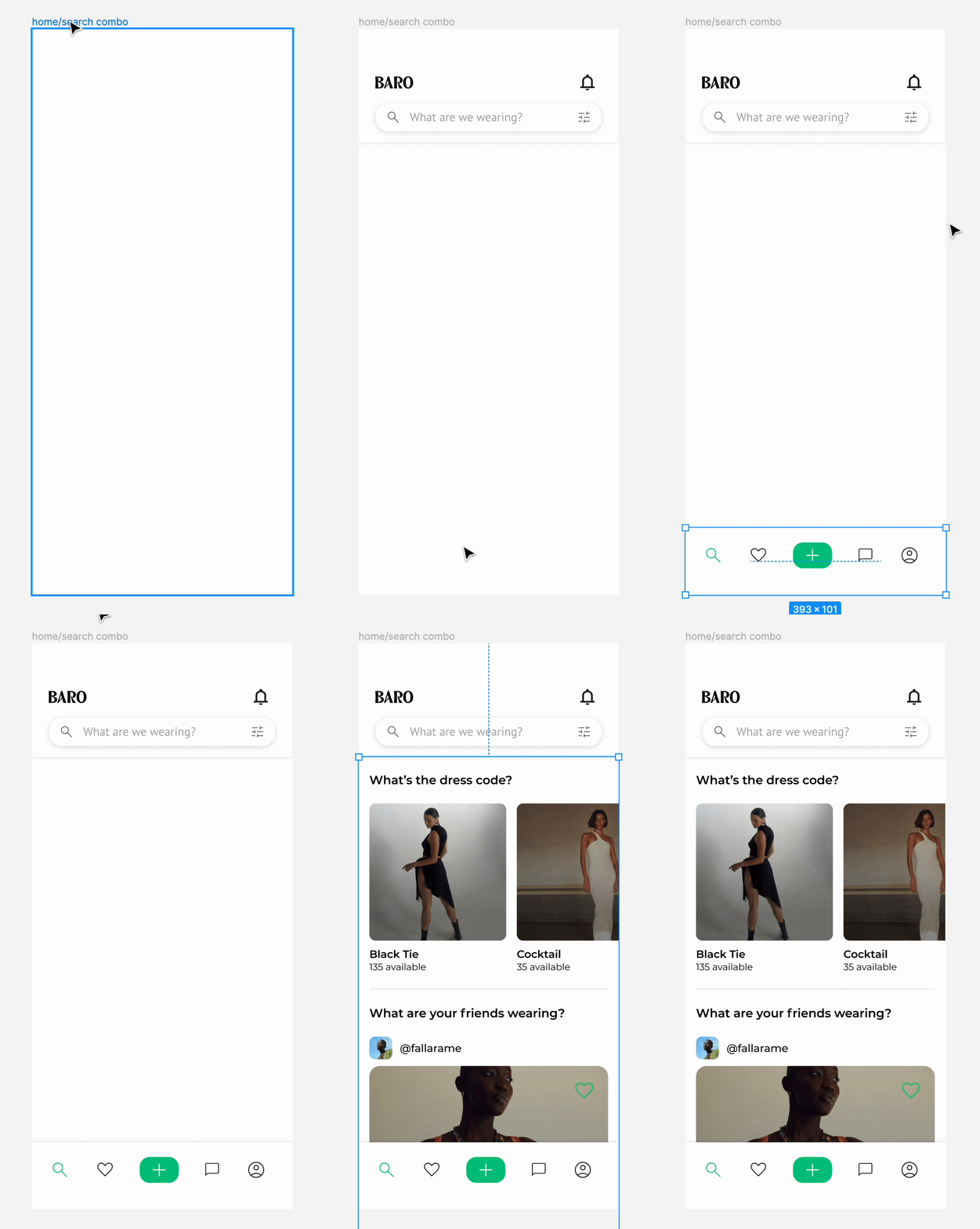
V1 was a highly ambitious version, including a search bar for effortless navigation, as well as a primary e-commerce section with a social feed below it. Each section was accompanied by relevant copy to illustrate its purpose. Additionally, all UI components have undergone accessibility stress tests. The nav bar had a prominent "+" icon to encourage users to list items, as a lack of user-generated content could result in reduced activity and slower revenue growth.
However, after collaborating closely with the engineering team, we concluded that implementing v2 was not feasible due to budget constraints. There would be significant engineering changes. Consequently, I scaled back and designed for v2.
I continued this 4 step process for about 40 existing screens in the user flow. Here are some of the final mock-ups:
Engineering pass off
To ensure a seamless handover to the engineering team, I made sure to clearly indicate the required changes and the design specs by redlining necessary screens. Additionally, I prepared a detailed slide deck that outlined the design modifications for each screen. The engineering team really appreciated the extra effort.
Next Steps
Currently, the Baro app is with our engineering team, who are working on implementing the updates throughout the app. After the updates have been made, a beta version of the app will be released to a limited number of users for testing purposes. The feedback obtained from the beta testing will guide our iteration process, and we will then begin design v2.
What I learned
During this super-fast design sprint I learned that sometimes, you need to adjust your design process to work with specific guidelines and limitations. It was a bit of a challenge to figure out how to revamp the user experience of an app while sticking to the current engineering limits. But while it was tough, it was also pretty satisfying to navigate that process and collaborate so closely with the engineering team.


