Birthwise case study

Role: UX research, UX design
Timeline: February 2023 - present
Team: Kimberly Zuleger (co-founder, doula) & myself
Project overview
Kimberly Zuleger is a doula & maternal health activist who reached out to me about creating a mobile app that has a more comprehensive and compassionate approach to pregnancy support. She had a general idea of what the app should focus on, but wanted strategic input and someone to design it. She gave me a budget to work within and flexibility to ideate within certain parameters.
The Problem
It's evident that most fertility, pregnancy, and postpartum apps are centered around an obstetrical approach. However, what many expecting and new mothers crave is a more comprehensive and compassionate approach.
The Solution
We are creating a doula/midwifery led mobile app that prioritizes the psycho/social aspects of pregnancy, providing a safe and supportive environment where mothers can share their experiences and receive advice with kindness and understanding. It's time to hold space for mothers in a gentler, more nurturing way.
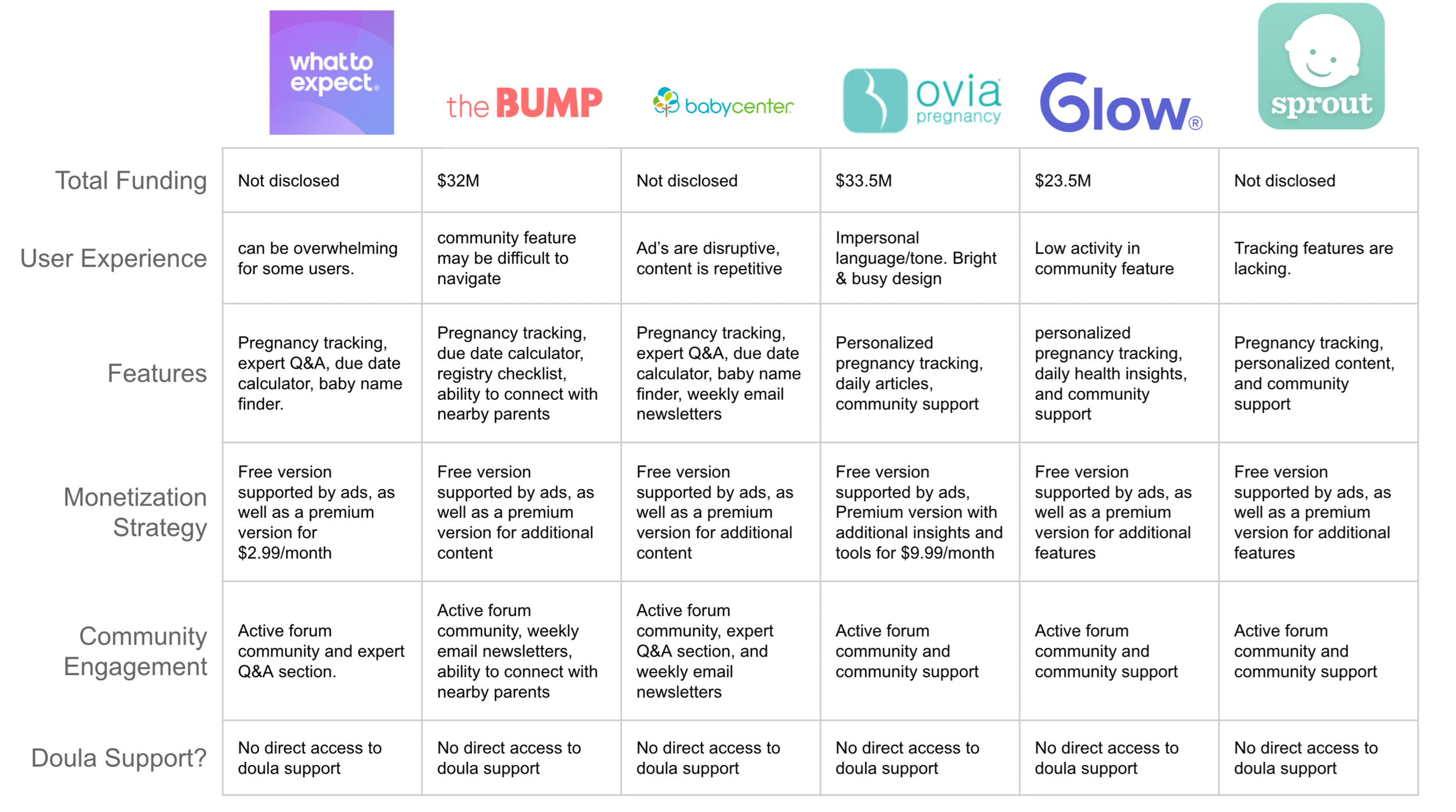
Competitive audit
To kickstart the process, I conducted a competitive audit by comparing popular pregnancy tracking apps. I evaluated the top 6 pregnancy apps across 6 different categories. Although many of the companies had very similar features and utilized a "freemium" business model, the significant gap in the market was the absence of integrated doula support.
Personas
I conducted user research to gain a deeper understanding of the primary user groups, their goals, and pain points. Given time and budget constraints, I opted to leverage the power of social media and reached out to the Birth Hour Patron Group, Hey Sleepy Parents, and Bay Area Mommies Facebook groups to gather survey responses from women. Based on the insights gathered from the survey responses, I developed two fictional personas to represent the primary user groups.


Pain Points
Both clients and doula, while they play a very different role, both expressed frustrations around organization or keeping track things and giving or receiving emotional support.
Ideation
To generate a diverse set of solutions that cater to the pain points of both user groups, I organized several ideation sessions such as Crazy 8's and brainstorming sessions to explore various features. Additionally, we had some fun brainstorming potential names for the app since the doula hadn't found one that stuck yet.


Narrowing the focus
To address users pain points effectively we chose to narrow the focus solely on pregnancy support instead of branching out to fertility tracking and postpartum support which came up in our brainstorming session. I began prototyping solutions to address the primary goal of effectively giving and receiving emotional support.
Connecting your support team
In order to effective find support the sign up process allows the user to either connect to a doula they already have or find a doula on the app.


Effective emotional support
Once you have connected with your support team it is important to effectively give and receive support. We created daily check-in form that is sent directly to your support team chat for easy coordination

Client facing user flow

Client facing wire-flow


Doula Facing
On the Doula's end, they would be able to keep track of all of their clients in one place. They would get notifications for messages, daily check-in's, labor alerts etc. They would also be able to see upcoming meetings with clients

Usability testing
These prototypes are waiting for the green light to begin usability testing. Due to budget constraints this project is being completed in phases. Kimberly, the doula who created the idea, is putting the prototype in front of other doula's and clients for informal market validation. Once I get the green light we will proceed with an unmoderated usability study to identify area's for improvement and begin iterating. We plan to conduct two rounds of testing with clients and doulas respectively.
Challenges
The biggest technical design challenge so far has been designing an onboarding process that allows you to either connect an already existing support team member vs. having the support team members create a profile specifically to support you. There are multiple solutions to this design problem to create a seamless user experience, but we are still iterating. Budget constraints and the timeline has also been a challenge. I generally get very excited about projects and want to go full speed towards the MVP. But, in this case the co-founder did not have the budget to engage developers or move forward with user testing right away.
What I learned
What I learned during this project so far is that sometimes the client doesn't know exactly what they want and the practice of design thinking is a great way to point the client towards an actionable solution or a meaningful idea. Projects like these are really fun to work on because you get to showcase your design process and influence the idea in a really meaningful way.